Remember when Windows Gadgets were introduced in Windows Vista? It was supposed to be the cool little widget engine for Windows that was meant to compete with the likes of the OS X Dashboard or Yahoo!’s Konfabulator. However, it rarely got any good major third party apps. In fact, the only good ones were primarily the ones that were built-in or developed by Microsoft. It was a major disappointment, but it also tended to chug on resources when not in view and it just never provided the functionality the most people cared for.
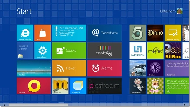
So will the new Start Screen suffer the same fate? After all, the Live Tiles are very similar to gadgets, and the Metro applications are much like widgets in fullscreen. Though given how you can’t ignore it, it might be something that Windows 8 users will grow used to or some ammunition for others to finally make the switch to a Mac.
The big thing is the Metro design language. I love it the way it looks and works in some places (Zunes, Xbox dashboard, WP7) but sometimes it can be pretty bad (Microsoft.com website and perhaps Windows 8). Even on many pro-Microsoft sites, a lot of people are commenting their strong dislike with the way Microsoft did it.
I can somewhat agree that Microsoft didn’t do such a hot job with Metro in Windows 8. Here are some reasons I believe the Metro Start Screen might become a fail:
1. Inconsistency with WP7 tiles – The tiles are similar to Windows Phone 7, but they’re not exactly consistent in both colors and icon style. In WP7, you get to choose a default color theme, like red or blue or whatever. In Wind0ws 8, the color theme only appears for the background and may charm bar icons. All the built-in apps have completely different colors. Then the Music and Video tiles have icons that don’t appear to exist in WP7 tiles. Whole point of tiles on Win8 was unified consistency with other products, right? Microsoft, please be more consistent with the way icons and color theme options work for the tiles.
2. Too many tiles – On Windows Phone 7, the Live Tiles or static tiles are nice and handy on a smaller screen. But on a desktop or laptop screen, so many tiles can be a bit more overwhelming. Sure, they can be somewhat grouped and such, but it can seem like a lot somehow. The ability to organize into folders or virtual folders would be useful. Also, why not make use of vertical scrolling? Maybe for hubs of tiles or something?
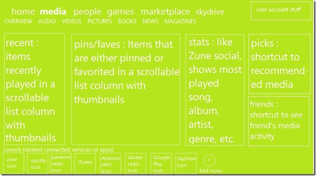
3. No hubs? – WP7 had ‘hubs’, you know, the area where related apps/shortcuts/content are all in one place? Yet Windows 8 appears to lack a Games hub, Office hub, Music + Videos, and a People hub. Everything is a separate tile with a separate interface. There’s no synergy for the most part. The photo app only allows some Facebook, SkyDrive and Flickr stuff. There really needs to be an emphasis on similar ‘hubs’ and more integration if Microsoft wants to connect the experiences across all products. Also, I would suggest that hubs are stacked in a vertical list, and tiles/content associated with a hub appear in a horizontal list. Use of scroll wheel could be used as a ‘semantic zoom’ and arrow keys or . What I’m described would look a lot like Windows Media Center without the gloss. Or maybe a horizontal list that splits up the hubs into tiers at the top similar to the Zune desktop software (like the top row will have the major hubs: Home, Games, Media, etc. and a row below that shows sections of the hub, like for Media, there’d be Music, Videos, Podcasts, etc.)
4. “Start” at the very top – The word appears at the very top and seems to be rather useless. It’s pretty obvious that’s the new Start menu/screen, and if it’s meant to be an official way for novice users to identify this part of the interface, I’m quite sure there are other more practical ways of doing so. Please get rid of the “Start” word at the top and if must be replaced with something, make it feel like it fits better.
5. Design is too flat and stale – Adding some drop shadows would really help give some depth to the tiles so it doesn’t feel like they’re stuck to the background and it looks nicer. Even a really small gradient could make the tiles more easier on the eyes, so you don’t have to shift from one solid color right into another one. The latest Xbox dashboard can have such shadows and some gradients why not Windows 8?
6. Lack of major apps – There’s a very small amount of ‘official’ apps from big-name companies that are available at the moment. Most of those apps are hardly noteworthy and barely do much. If Microsoft can’t get major companies on board, there will likely be few independent apps that will of high quality. People want to be able to access their favorite services, games, and such from the brands they trust most.
7. Needs more ‘contracts’ – There’s a limited amount of Contracts currently. If Microsoft could get more picker, search, and sharing contracts, it’d really help give some credence that the Start Screen can be very useful.
8. Apps might be too dumbed-down – On a smartphone, it might be somewhat acceptable, but we’re talking about a desktop environment. The Metro apps need to do a good job of balancing the needs of users with the simplicity that Metro aims for. I’m quite sure if developers try hard enough, they can give achieve both form and functionality.
I still have mixed feelings about the Start Screen. I hope that more customization, real use of hubs, making Metro more lovable, and getting major third-party developers involved will be key to whether the new Start Screen will be a hit or miss for Windows. Unlike the Windows Gadgets, the Start Screen isn’t something most people will be able to ignore unless they find some third-party solution, and it might make users love Windows more or push them to get a Mac. Hopefully, Microsoft will have it down by the time it’s finally released.

